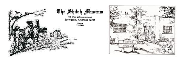
Since opening to the public in 1968, the Shiloh Museum of Ozark History’s branding has included illustrations and logo variations for its letterheads, notecards, and other material. For example, in the late 1970s, the museum’s newsletter featured a rustic illustration of a man plowing a field with two horses, paired with the museum’s name in an Old English-style font. By the early 1980s the museum began using a sketch by local artist Helen Leflar of Fayetteville showing the museum when it occupied the former Springdale Public Library, located where the museum is today. It appeared on official letterhead and notecards, as shown on the right here.
Shortly after, a logo depicting a man and woman peering through the “O” in “SHILOH” made a brief appearance. That design gave way to the museum’s first official logo, created by Design Communications of Little Rock and funded by an anonymous donor. Adopted in 1986, the logo showed a couple featured above a stylized small community backed by rolling hills. It served the museum for over 20 years.
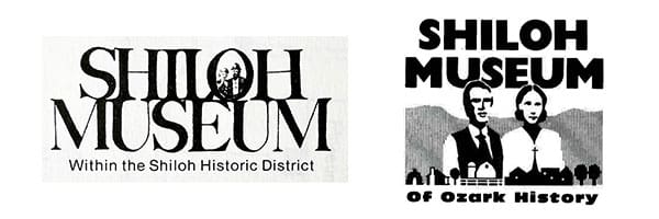
During that time, the institution changed its name to the Shiloh Museum of Ozark History and broadened its scope to six counties. As the region grew more diverse, the logo no longer reflected the population the museum represents.
In 2007, a fresh identity emerged. Designed by Liz Lester of Fayetteville, the new logo featured a house with smoke curling from its chimney, nestled in soft green hills. This design marked a shift toward a more inclusive and modern image, incorporating both vertical and horizontal layouts.
A FRESH LOOK FOR 2025
In 2025, the museum introduced its current logo following a collaborative redesign process involving staff, the Board of Trustees, and Creative Services Manager Sue Artiga.
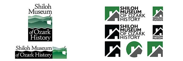
Sue reimagined elements of the 2007 version, focusing on a single, symbolic detail: the roofline of the museum’s 1850s Ritter-McDonald Log Cabin. She added an open doorway to symbolize welcome and inclusion and placed it against a bold green background representing the Ozark hills. A clean, geometric sans-serif font brings a modern touch to the museum’s full name.
To meet the demands of the digital age, the new logo comes in multiple formats, including black-and-white and seven solid color versions plus matching social media icons.
THE MISSION REMAINS THE SAME
As the look of the Shiloh Museum of Ozark History continues to evolve, Shiloh remains dedicated to preserving, sharing, and celebrating the stories of the Arkansas Ozarks. Everyone is invited to explore the Ozarks. All are welcome!